AD: This blog post about flat lay photography is a guest post, including a sponsored link marked with a *.
Hello! It’s been a while. I’ve been really busy with lectures/deadlines/dissertation things recently, and I’m off to Athens this weekend for an archaeology trip! Make sure to check out my Athenian Photo Diary.
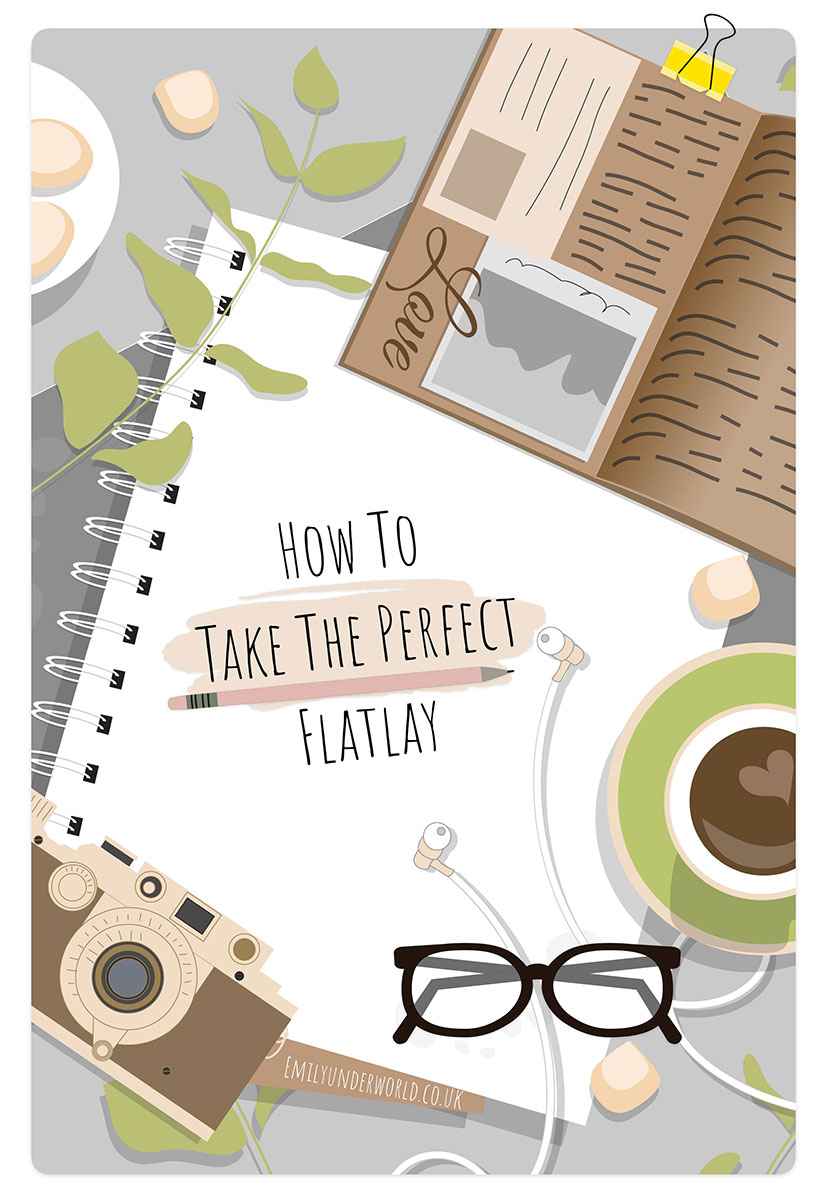
Anyway, today’s blog post is all about the art of the coveted flat lay, a blogging photography favourite.
Fabulous Tips For Some Fantastic Flat Lay Photography
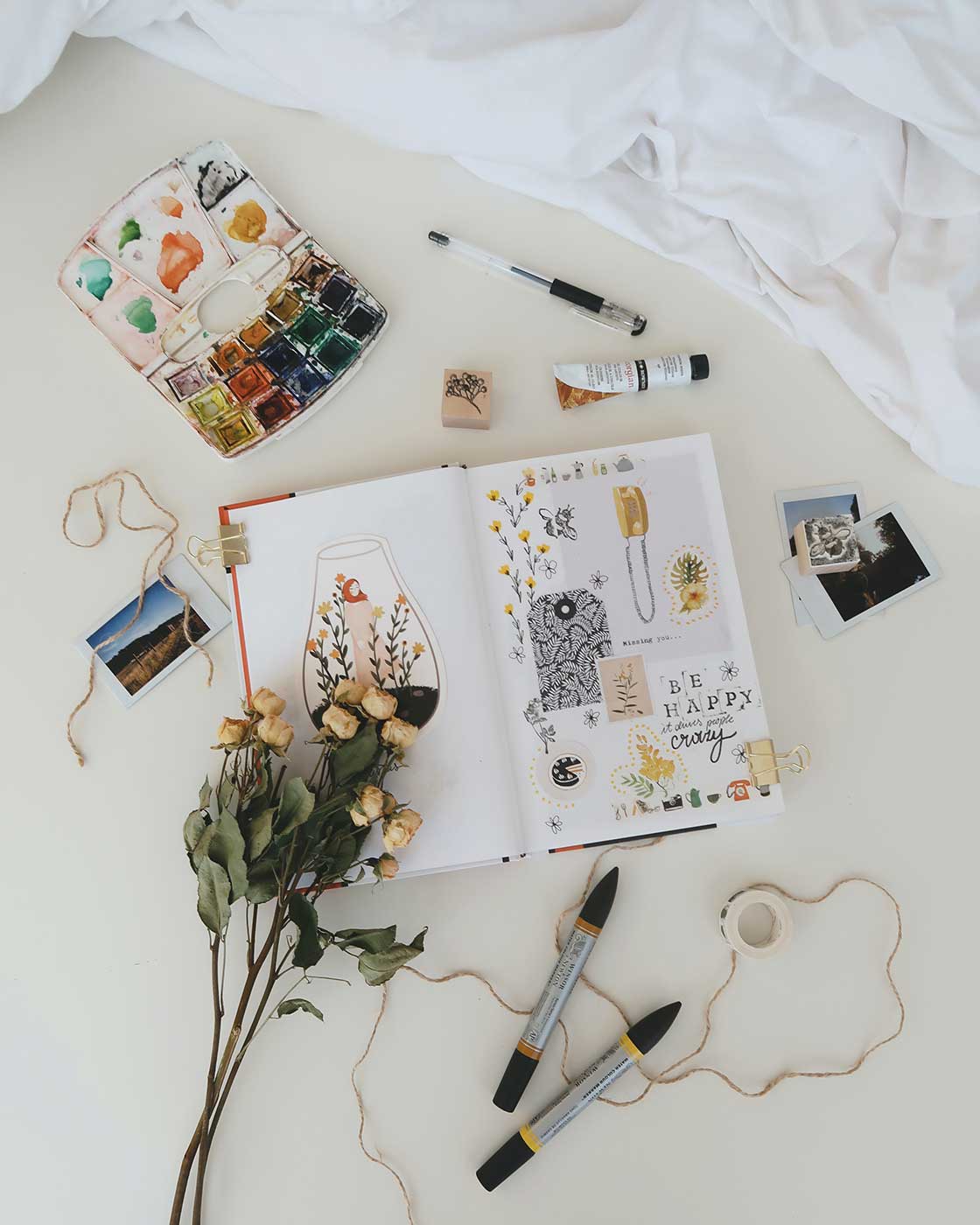
If you haven’t seen any flat lay photography lately, where have you been? For both bloggers and Instagrammers, it is a great way to get your posts seen. You can show things from a haul, food, recipes or beauty products for example.
The great thing about flat lays is that they can be shot anywhere. You could use a table, desk, or even the floor. But it isn’t quite as simple as having a few bits laid out and taking a shot with your camera.
To really make your pictures really pop there are a few steps that you can follow. Here are some flat lay photography tips to get you started.
Choose a Colour Scheme
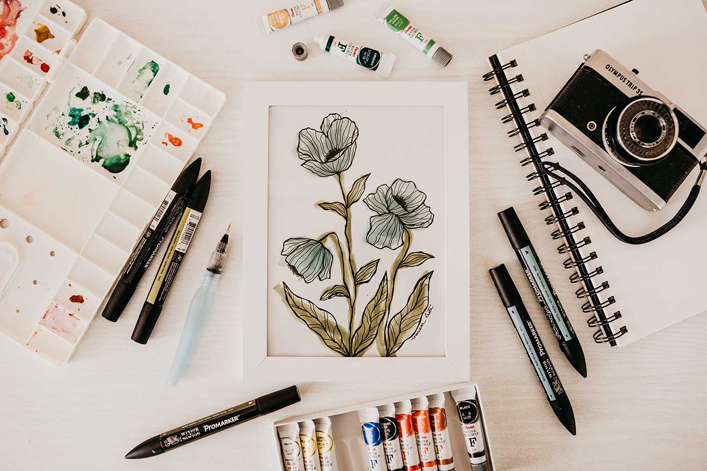
If you choose a colour scheme for the picture to follow, it’ll look more cohesive and generally ‘together.’ The items don’t have to all be the same colour, just think about different shades and complementary colours.
It is also a good idea to think about the background colour. As a rule, it should be plainer than the rest. White, marble, and wood are popular. But you could also use tiles, grass or even something like sand.
Think About Lighting
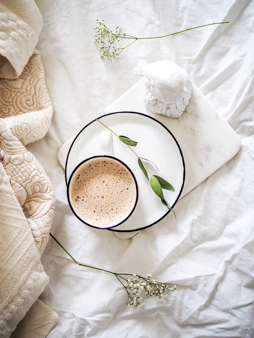
Lighting is important in any photography. If you use unnatural light, it really can affect the look of the photo. You might edit it, and this could make it look even more unnatural. So try to get the most natural lighting available. Pictures by a large window (when it isn’t too sunny) are best.
If you were a business or a professional blogger, then you might consider a location shoot for your photos from somewhere like 1st Option* for instance. You’d need a kitchen with a lot of natural light if you’re a food blogger, for example. Then you can make that recipe flat lay look awesome!
Follow the Rule of Thirds
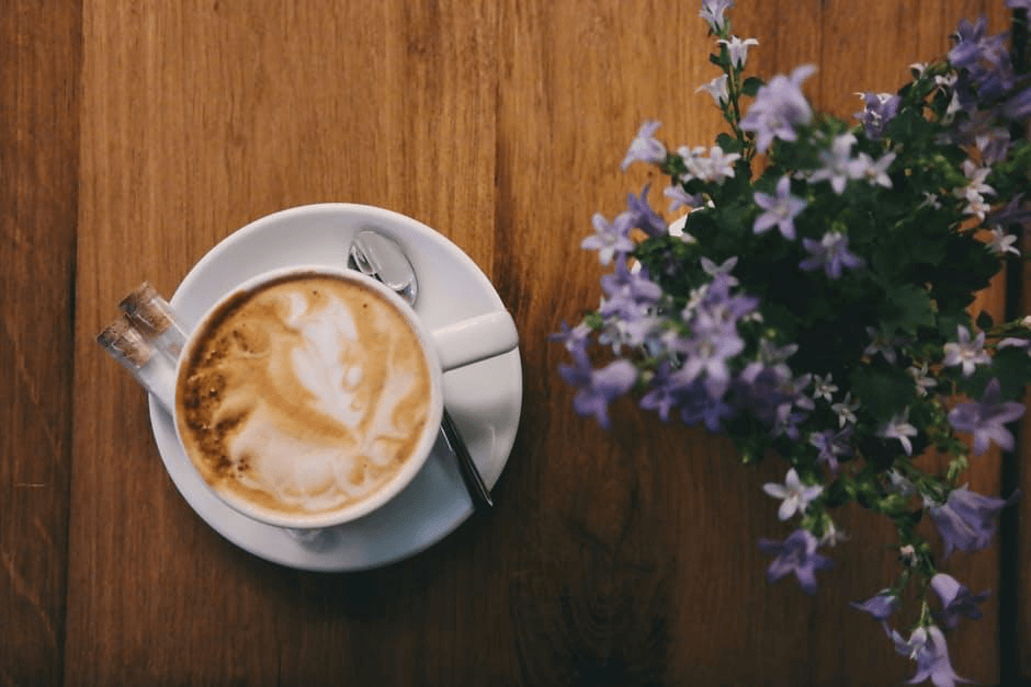
Striking flat lays often follow a similar trend. The same can be said of the most stunning photography too. The subject of the picture doesn’t need to take up the whole space, so why not consider using the rule of thirds by dividing your pictures into a grid of 3×3? Generally, there should be a third of the space left empty. This can help to unite the image and makes it a little more interesting, as well as giving a specific focus to the picture.
Make sure to read my blog post all about how to improve blog photography.
Is Your Flat Lay Telling a Story?
We keep going back to food photography, but it is a great example with storytelling in mind. Your flat lay photograph can tell the story of the recipe. You might lay out some of the ingredients that are included in the recipe. The narrative is what you are making, and how it will be done.
So perhaps try to think about the story your flat lay is telling next time you try to take one! Will it be about travel or about Sunday brunch, for example? For travel photos, it could include your passport, a map, sunglasses, and a camera, showing that you’re planning a trip, or packing. Then your photo can tell a story, rather than just show the items that you have.
I’ll try to take a good travel-themed flat lay when I pack for Athens!
All the best,

Pin This for Later?

I always wondered how bloggers produced beautiful flat lays. Thanks for sharing this.
Thank you for sharing these tips! I still need to get onboard with flat lay photography as I love seeing this style of photography but not ventured out into creating any myself yet. I never usually know where to start but your advice has been really helpful! :)
VioletDaffodils
xx